
This page showcases the core WordPress (Gutenberg) blocks this theme supports, grouped by type with a short description of when to reach for each one.
Headings
Headings structure a page into clear sections, helping readers scan and navigate long-form content. Use them in order (H2, then H3, then H4, and so on) rather than skipping levels.
Heading 1
Heading 2
Heading 3
Heading 4
Heading 5
Heading 6
Styled Text
Bold, italic, and linked text add emphasis and let you weave references into a paragraph without breaking the reading flow.
Lorem ipsum dolor sit amet, consectetur adipiscing elit, sed do eiusmod tempor incididunt ut labore et dolore magna aliqua.
Lorem ipsum dolor sit amet, consectetur adipiscing elit, sed do eiusmod tempor incididunt ut labore et dolore magna aliqua.
Highlighted Text
A paragraph can carry its own background color and padding — useful for a small highlighted note or aside within body copy.
A paragraph with its own background color and padding — handy for a small highlighted note or aside within body copy.
Math, Superscript & Subscript
Superscript and subscript formatting (from the toolbar’s text-formatting menu) covers exponents, footnote markers, and chemical or mathematical notation.
Superscript: E = mc2. Subscript: H2O. A citation reference1 works the same way. Mathematical notation reads naturally alongside regular text, for example the golden ratio φ = (1 + √5) / 2, or a summation ∑(xi) for i = 1 to n.
Icons
A Custom HTML block can drop in inline SVG icons anywhere in the content — useful for small inline marks or a row of feature icons.
Lists
Lists break information into a sequential or unordered set of items, making steps and options easy to scan.
- First list item
- Second list item
- Third list item
- First step
- Second step
- Third step
Quotes
Quotes attribute a statement to a source and set it visually apart from body copy. A pullquote pulls a single line out to stand alone as a bigger visual moment.
Lectus tortor habitant diam eget lacus pulvinar mattis. Adipiscing volutpat nisl viverra molestie vulputate convallis aliquam.
Risus risus mauris proin aliquam sed nisl scelerisque.
Preformatted & Code
Preformatted text keeps line breaks and spacing exactly as typed. A code block does the same in a monospace font, for snippets meant to be read as code.
Line one of preformatted text.
Line two — spacing and line breaks   are preserved exactly as typed.
function greet( $name ) {
    return "Hello, {$name}!";
}
Buttons
Buttons drive user interaction — use a filled button for the primary action and an outline button for a secondary one.
Images
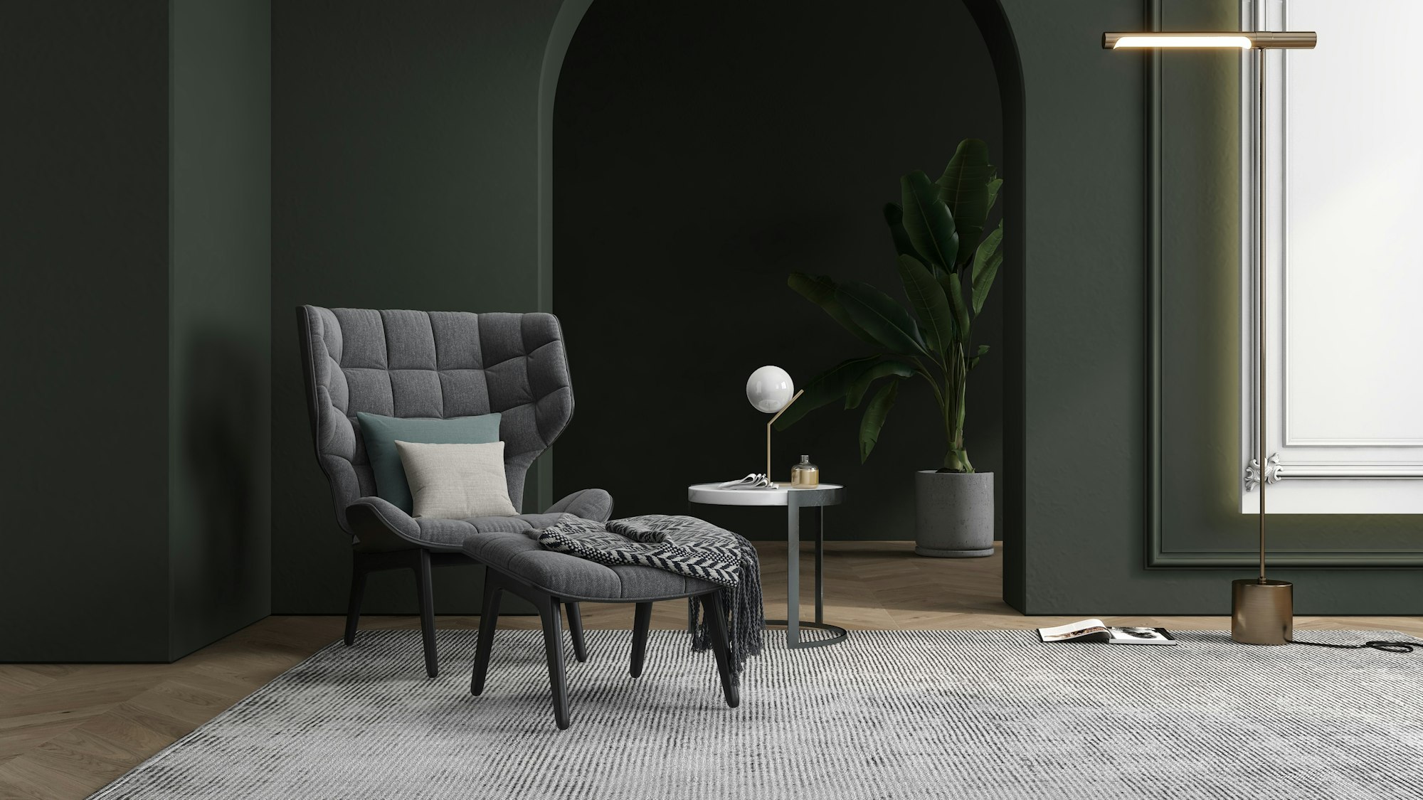
Images adapt to the device viewing them. There are three widths available: regular, wide (breaks out of the text column), and full (edge-to-edge).


Float Alignments
An image can also float left or right within a block of text, with the surrounding paragraph wrapping around it — the classic magazine-style layout.

In auctor sapien lobortis sit justo iaculis pulvinar suspendisse. Netus hendrerit id tempus eget. Fames viverra nulla quis habitant semper sem. Sem nibh nam feugiat nunc est pellentesque cursus pulvinar quam. Dui urna duis accumsan diam. Eros enim amet lacinia ut quam purus a. Convallis auctor enim consequat pretium morbi ac lacinia. Proin tincidunt nullam dignissim habitasse tempus sit fringilla faucibus massa.

Libero molestie mauris tincidunt scelerisque rhoncus neque senectus. Sem commodo pellentesque neque etiam morbi eu molestie eu. Pharetra a lectus pellentesque morbi et aliquet mattis enim commodo. Mattis nisi aliquam orci integer mauris ac sit. Risus pellentesque duis vel non eget cursus sit. Magna urna consequat consequat quam.
Media & Text
The Media & Text block places an image beside a block of text — either side by side, image first or text first — good for introducing a feature, person, or product.
Image on the left, text on the right — useful for feature highlights or introducing a person or product alongside descriptive copy.
Text on the left, image on the right — the same block, mirrored, so you can match whichever layout best suits the surrounding content.
Gallery
A gallery brings multiple images together in an organized grid, letting visitors browse a set of photos and enlarge any of them on click.



Columns
Columns place content side by side — useful for comparisons, feature lists, or breaking a long section into parallel blocks.
Turpis scelerisque vitae eu netus lacus est in vulputate egestas. Aliquet porttitor sed nam facilisi accumsan.
Auctor tortor in adipiscing et amet pharetra. Dictumst aliquet sociis id suspendisse eu quis proin sit sagittis.
Group & Cover
A Group block wraps content in a shared background — handy for callouts or asides. A Cover block layers text over a full-bleed image.
A highlighted group of content with its own background color — useful for callouts, asides, or a sponsor blurb.
Cover block text over an image
Table
Tables organize data into rows and columns, giving structured information a clear, scannable layout.
| Plan | Price | Storage |
|---|---|---|
| Starter | $9/mo | 10GB |
| Pro | $29/mo | 100GB |
| Business | $79/mo | 1TB |
Video & Audio
Upload a video or audio file directly to the media library and it plays right on the page with native browser controls — no external service required.
File
The File block shares a downloadable resource directly on the page, with its own title and a Download button.

Embeds
Paste a supported URL on its own line and WordPress automatically embeds rich content from services like YouTube, Vimeo, and Spotify.
Search & Tag Cloud
The Search block adds a functional search form. The Tag Cloud pulls straight from the site’s real tags, sized by how often each one is used.
Business Creative Lifestyle Photography Reports Technology
Social Links
A row of linked social icons — drop in whichever services are relevant and the icon set updates automatically.